The fairly neutral (somewhat positive) state of America
Meaning, Methodology, Map, Figure 2, Figure 3, Figure 4, Figure 5, Figure 6
In the days leading into the 2018 U.S. midterm elections, tweets mentioning “Trump” were fairly neutral. To reiterate, those were tweets that mentioned “Trump” and not necessarily Tweets about him.
Of that Tweets that were “polarized”, there were more positive Tweets than negative Tweets, however the negative Tweets were more polarized than the positive Tweets.
Out of 66,802 Tweets collected, 44502 contained location data, and 26,013 were confidently attributed to being from the United States. That does not mean the rest were not, but that their location was not definitively verifiable.
The average polarity score for Tweets originating from the United States was 0.035 while all Tweets worldwide (including the U.S.) averaged 0.028. The scale the scores were based on was from 1.0 (most positive) to -1.0 (most negative).
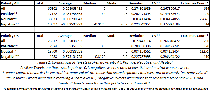
Overall, Tweets originating from the U.S. tended to be slightly more positive than all the collected Tweets combined.
However, over 81% of the “neutral” rated tweets that originated from the U.S. received a score of “0” versus a little less than 77% from all. This implied “neutral” tweets from the U.S. were more like to be “truly neutral” than the rest, even though both sets were incredibly likely to be “truly neutral”.
Aside from the totals and the mentioned differences, the Tweets from the U.S. were a consistent sample of all tweets. In all other calculations the difference between the two set was less than a percentage point – if there was a difference.
In both sets, the overall average was on the positive side of 0, even though they still fell in the neutral range. However, their “negative” tweets were more likely to be extreme and the absolute value (distance from “0”) of their average score was greater than the absolute value of the average score of their “positive” tweets.
Only 0.92% of the Tweets from both sets received a polarity scale score from one of the extreme ends of the scale (1.0 or -1.0).
The differences were more apparent when broken down by U.S. state (and D.C.), but still weren’t drastic as every state’s average polarity score still fell into the “neutral” range. The “neutral” tweets of most states represented over 50% of their totals, with except to Wyoming and Delaware, but more on them later.
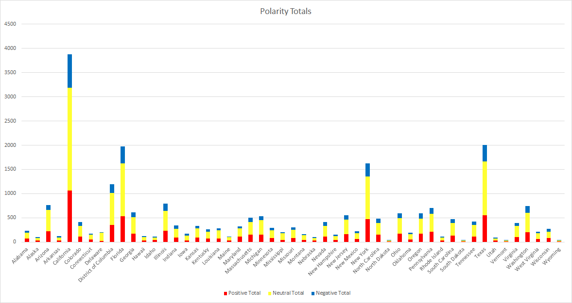

California claimed the most tweets, nearly double that of Texas, the 2nd most. California, by proxy, also lead in every other Tweet count category. In contrast, North Dakota had the lowest number of “positive” tweets, Wyoming had the “lowest” number of neutral Tweets, and South Dakota had the lowest total and number of “negative” Tweets.
Wyoming was the most diverse state. All three categories had a fairly equal number of Tweets (32% positive, 39% neutral, 30% negative). This was more than likely a product of their low totals (14 positive, 17 neutral, 13 negative).
Delaware on the other hand was the most uniform state. A staggering 80% of their Tweets received a “neutral” rating, where as only 13% were positive and 7% negative. They were one of 9 states whose Tweets did not receive a polarity score from either extreme.
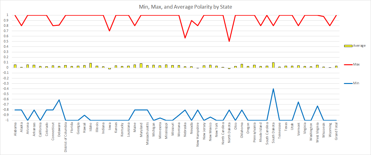
South Dakota’s average tweet polarity almost broke into the positive range (0.0002 points away), but they stayed “neutral”. A total of 48 of the 51 states (and DC) had an average polarity over 0, but below 0.1 – the positive threshold.
No state had an average polarity that was even close to breaking into the negative range. The lowest was Iowa with an average polarity score of 0.0236.
The only other two states with average scores below 0 were North Dakota and New Hampshire, the latter being -0.0006. The variance for the averages was 0.0005, New Hampshire was just about 0.
In total, 26 state had both extremes represented and 42 states had at least one of the two.
South Dakota had the least extreme “negative” Tweet as none were given a polarity score below -0.4. Conversely, North Dakota had the least extreme “positive” Tweet as no polarity score went over 0.5.
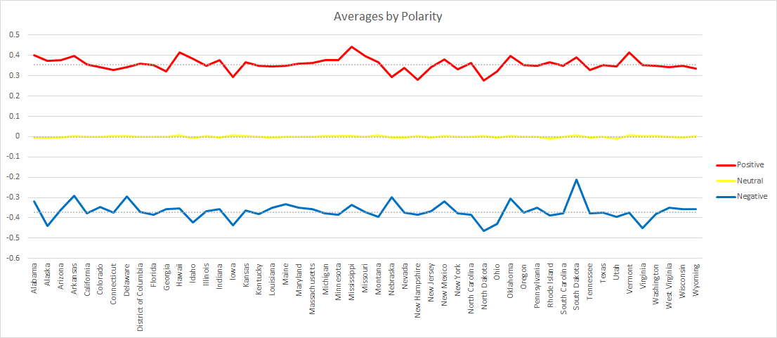
The average polarity of each of the three categories were consistent within their own. The most consistent were the neutral tweets with an average of -0.00017, a median of -0.00014, standard deviation of 0.000016, and a variance of 0.00396.
The state whose average polarity score was the closest to the national average and matched the national median was Colorado. This would suggest Colorado matched the national sentiment.
Delaware’s “positive” Tweets matched the median and was closest to the average for national “positive” Tweets and Massachusetts did the same for the “neutral” category.
New Hampshire’s “negative” average was the closest to the national “negative” average, while Iowa’s “negative” average matched the median. This was the only category that had different states for the average and the median, a product of having the lowest total but the highest absolute value.
Although South Dakota had the highest overall average, Wyoming had the highest average in all three categories (“positive”, “neutral”, and “negative”).
The state whose “negative” average was the most negative was North Dakota. This is consistent with having the lowest “positive” average, but not with Iowa claiming the most negative overall average.
So, what does it all mean?
Well, for one take these results with a grain of salt. Between the technical complications experienced, function of the sentiment analysis tool, and the difficulty in extracting accurate location data from user inputs (all of which can be read about in more detail in the methodology section), there is a good change these results may have an unintentional bias or skewed. Even if the results are accurate, this is only one social media platform – the most public one.
However, if these results are accurate, then perhaps the United States isn’t as divided as proposed narrative concerning modern political discourse. Certainly, there are social media filter bubbles and polarization. It isn’t unfathomable that the most extreme voices are the most likely to cut through the noise as extremism can equate to conviction.
From every angle, these results suggest the mass political discourse is neutral and those that do participate in polarized speech do so in a more positive manner. Of the nearly 67K tweets, over ¾ of them scored between 0.1 and -0.1 on the polarity scale. Of those that score beyond those thresholds, their average was significantly closer to 0 than their polar ends (1 and -1).
This is not to say there isn’t divisive speech as there were still Tweets spread throughout the range including those along the ends of the spectrum, but the latter only made up 0.92% of the total. For every Tweet that received a 1 (most positive) or a -1 (most negative), there were 48 that received a score of 0, or “true neutral”.
The message here isn’t that there is nothing to worry about. Political discourse seems fairly divisive and combative, but perhaps it isn’t as apocalyptic as commentators suggest.
Methodology
First, I wrote a script to mine data from Twitter. Last time I saved the incoming stream directly to a JSON file without any processing. This resulted in files that were 2gb per 500 Tweets. That would have been over 240gb of JSON files for number of Tweets I collected this time.
This time I wrote the script to pull specific data from the incoming JSON data and saved it directly to a MySQL database. This was a mistake. Whereas last time the JSON was collected and written directly to my hard drive, this time the script had an extra 200 lines of code processing the incoming JSON before writing it. Tweets filtered for “Trump” were coming in more quickly than the script could process them.
To make a long story short, the script broke. It didn’t kick back with an error message, it just broke. I had the script wrapped in a “While 1” loop that would just loop an infinite number of times until I did the manual keyboard interrupt. The script listening to the Twitter stream was done using a “For” loop – “For tweets in stream”. I had print functions scattered throughout the script for troubleshooting purposes. The “For” loop was flanked by two other print functions; one to state that the script was starting and at the very end I wrote one saying it was ending.
The script would start. I would watch as it returned the various data that I had written it to print. Somewhere between the 150th to 200th Tweet the script would take a long pause. Then, it would stop printing the Tweet data and just rapidly loop through the “starting” text and “ending” text. I wrapped the “For” loop in a “Try” and “Except” and wrote it in to print the error message should there be one, but there wasn’t. No exception, no error message, it simply decided to completely ignore the “For” loop. This caused the data to be collected at irregular intervals, as it couldn’t be set and forgotten – it needed some babysitting.
Next, the text of the Tweet ran through a sentiment analysis Python module named “TextBlob”. One of the limitations of many sentiment analysis tools is that they perform word by word analysis. It splits text into individual words, gives each word a rating from 1 to -1 and averages it out at the end. That means a sentence such as, “Nazis are bad,” would come out negative because of the lack of positive words.
The next step was locating the Tweets. During the processing of the JSON data, the script was written to search for both coordinates and location data. First, it searched for any hardcoded location information, city, state or region, and/or country. If that information wasn’t present, it’d look or user inputted location data – which would become problematic later because of my own negligence. In total it found location data for 44,501 tweets and did not find any location data for 22,027.
For mapping purposes, the data was uploaded to a Google Fusion table. Only 9 Tweets had coordinates attached to them. However, Google Fusion tables have an option to geocode data. It even produces a map for you. The caveat is if you want to use the map for anything, you must publicly share it.
For doing state by state analysis, I wrote a script to go through the location of each Tweet searching for state names and abbreviations. It didn’t work perfectly. Some of North Carolina ended up in South Carolina’s, same thing with the Dakotas, and some Tweets got completely skipped over.
But that wasn’t the worst of it. The worst was processing state abbreviations. First, there was an incredible amount of discrepancy in the way people abbreviated. Some people put periods between the initials, others didn’t, a handful did half and half. Secondly, many state abbreviations are simple words – like Indiana (IN) and Oregon (OR). Needless to say, data cleaning for over 44,000 tweets was time consuming.
Finally, the data was export from MySQL into a CSV which was subsequently turned into an XLSX. A pivot table was created to get the state by state averages and counts. Averageifs and countifs were used to get separate out the positive, negative, and neutral Tweets. Index matches were used to find states that matched the average, media, min, and max. And charts were made to visualize the data.
